Manage your account
…
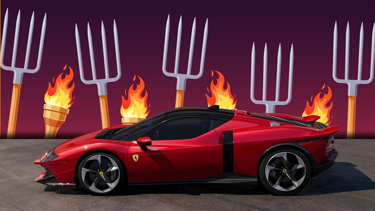
The new Ferrari Testarossa design has been public for about 48 hours now, and the ratio of excitement to ick reactions around the internet is unreal. Keyboard commentators almost universally hate the thing; meanwhile, I think it’s actually pretty cool.
Obviously, any automaker is playing with fire when it resurrects a legendary nameplate. A vocal minority’s always going to be disappointed, and there’s invariably a loud contingent who prefer the old version. Hardcore fans of the original anything tend to pre-commit to disliking new iterations regardless. But in over a decade of covering cars, I don’t think I can remember an enthusiast product so resoundingly disapproved of in comment sections around the internet as this new Ferrari.
The Ford Mustang Mach-E also debuted to some polarized reactions, and I know more than a few people are sad about how the new Chevy Blazer and Acura RSX compare to their old-school counterparts. But a Ferrari, a car most people will only ever see rather than drive, invites an elevated level of design critique.
Our story introducing the car has over 80 comments right now. Pretty much all of them, except for mine, are some variation of “don’t like it.” Road & Track and Car and Driver‘s coverage had a few more charitable responses to the new Testarossa’s looks, but even the r/Ferrari subreddit appears to be mostly downvoting the design.
One of the most common complaints is that the 849 Testarossa doesn’t look like the flat and wide Testarossa my fellow millennials remember. Which, fair, it doesn’t. Though that ’80s icon didn’t look much like the 250 Testa Rossa (two words, but same name) that predated it, either.
While the new car obviously lacks the flying afro pick side strakes, it does have its own unique side-vent thing, in that vertical black line feeding into an intake. The black bar across the front, a design element appearing on a bunch of modern Ferraris, arguably adds a retrofuturistic feel that could be interpreted as an indirect nod to the pop-up lights that the Prancing Horse brand used to love.
The new car’s rear section doesn’t have the ultra-wide grate or buttresses, but it’s similarly dramatic to the old car, with a huge engine bulge and width accentuated by the spoilers at the outer edges of the rear sill. The latter feature is more a reference to the 512 sports prototype of the late ’60s and early ’70s than anything else.
All this to say, we’re definitely not looking at a modernized ’80s car design. But I could see how designers would arrive at this as a modern interpretation of the same general ideas the last Testarossa was going for: wide and intense.
And while the new Testarossa face in particular has a strong resemblance to the new F80, I think it’s sufficiently distinctive within the Ferrari lineup.
Now I’m wondering if people hate it because they really think it’s ugly, or they’re just not happy with the Testarossa name returning on a modern machine. If it were called something else, would you feel differently? The Lamborghini Countach revival from 2021 had a much less harsh reception, but it’s also a much more sedate design.
Even as a fan, I will concede, “GTO” might have been a better storied nameplate for Ferrari to bring back here. The black line across the bow looks a lot like the snout of the ’80s 288 GTO. And that car, like today’s Testarossa, had a twin-turbo V8, while of course the old Testarossa famously ran a V12.
It’s understandable why fans aren’t doing backflips over a triumphant return for a classic icon with this new 849 Testarossa. But if you’ve scrolled this far, I’d be curious to read comments on what, exactly, you dislike about the car’s look besides a lack of consistency with the last model to bear its name.
Got a tip? drop us a line at tips@thedrive.com.
Car accessories
Help
About us
About our ads
Licensing
Sitemap
Follow us on
© 2025 Yahoo. All rights reserved.

