BMW’s logo isn’t a propeller, no matter what you’ve heard. It’s also about to disappear, at least the way we know it now. Bayerische Motoren Werke is changing its logo once again to coincide with the launch of the iX3 electric crossover. It’s not going to be a big change, but it is going to be the second change is a shockingly short period of time for a brand that had once used the same emblem for decades.
Blue and white crossed flags inside a black circle with BMW along the top. That’s always been the company’s logo and badge, and you’ll find it on all of its cars, right? Not quite. This latest change will actually be the sixth new logo – or maybe the seventh, depending on how you look at it.
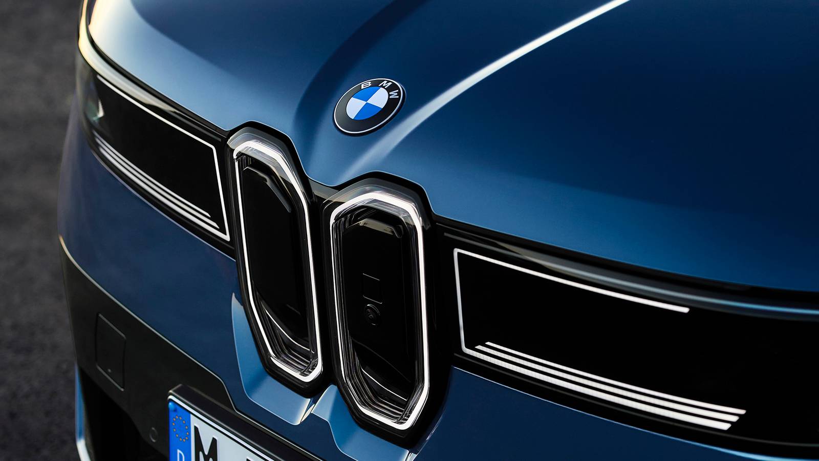
Spotting the changes to the roundel BMW has used since 1997 will be tough. The difference is in the details, though, as in BMW has removed some. Look at the old badge and there is a separation between the blue and white sections as well as surrounding the inner ring.
The new badge, which first showed up with the reveal of the Neue Klasse BMW iX3, drops the separation. It still has a ring on the outside, but the inner ring and the center cross are both gone.
Neue Klasse head of design Oliver Heilmer explained the change to BMW Blog. “We wanted to keep the heritage, but bring more precision to the logo,” he said “The chrome is still there, the letters have been refined with a shiny pattern you often find in watches, and the white surfaces now sit closer to the outer ring. It’s flat, but when you touch it you can still feel the ridges.”
The black ring itself is also different. The finish will be matte, not glossy, though you probably won’t notice. BMW has also dropped the blue border that it reserved for electric vehicles, a way to help show that they’re not a separate thing from the rest of the brand. BMW will start rolling out the new logo as it refreshes and renews its lineup.
BMW’s last big logo change was in 2020. It introduced a new version without the delineations but also without the black roundel. It was transparent, meant to be better for digital use. While that one was used on the i4 concept car, it wasn’t used in production.
The current badge dates to 1997, though BMW has had some variants including ones with red, blue, and purple to mark BMW M’s 50th birthday. Before that, you need to go back to 1963. That logo used white instead of silver, which made the separation lines less visible. Before that was a 1953 logo which used white along with a different font. The first badge came about in 1917 and used gold trim, with a 1933 version taking the gold and adding thicker lines and letters.
When BMW introduced its first badge, cars weren’t even a consideration. It was an aircraft engine company during the First World War, and it made motorcycle engines after the conflict ended. Despite that, it’s not meant to be a propeller. It’s the flag of Bavaria, the home state of the company. The propeller myth, BMW says, came from an ad in 1929 that showed it in a propeller, because it happened to be a good fit.
Source: BMW Blog
We want to hear from you! Share your opinions in the thread below and remember to keep it respectful.
Your comment has not been saved
This thread is open for discussion.
Be the first to post your thoughts.

