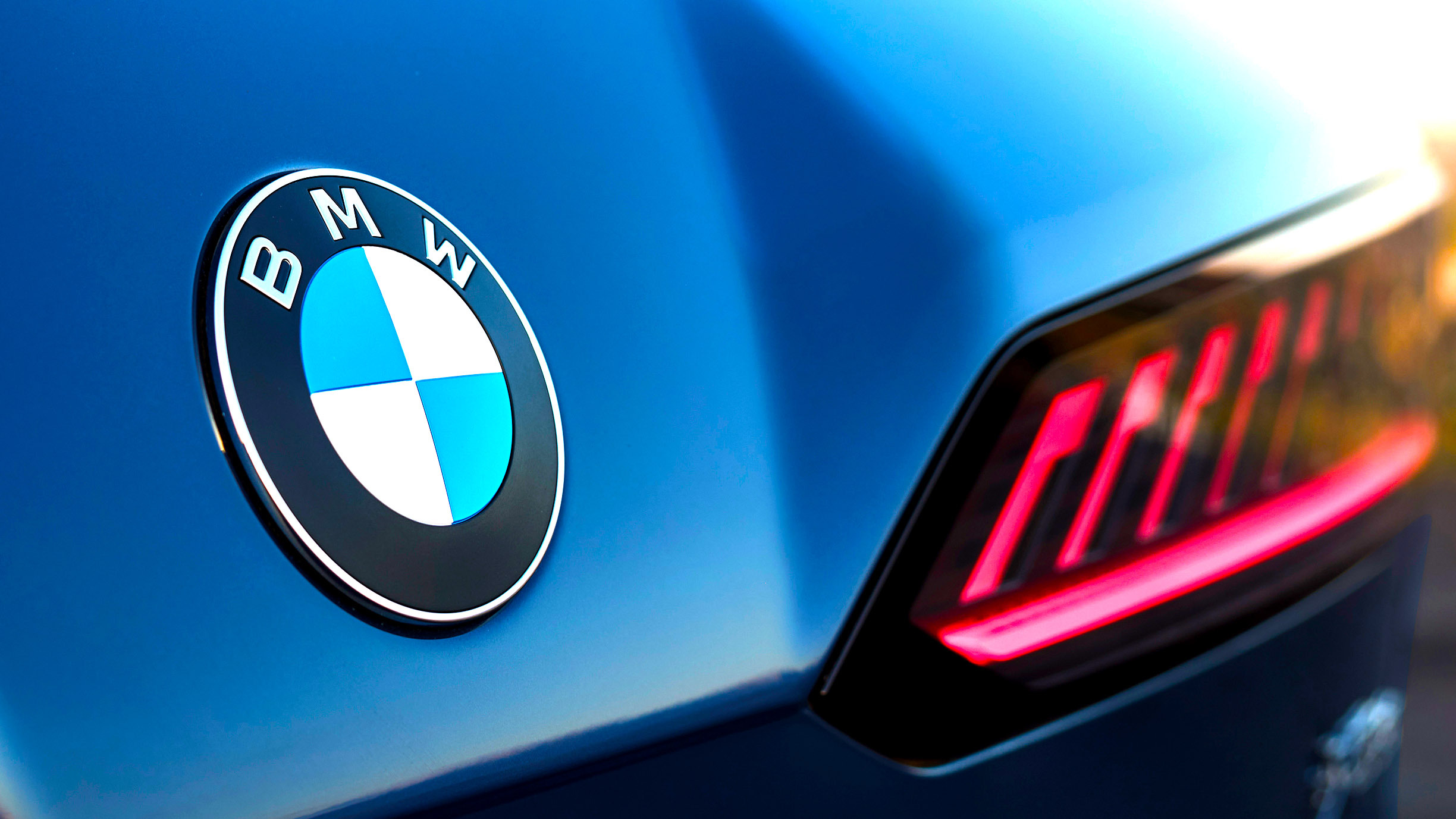
Cleaner-looking roundel on Neue Klasse iX3 ditches the inner chrome ring surrounding the propellor
BMW’s electric iX3 debut at the Munich Motor Show introduced us to the brand’s Neue Klasse design language. But with so much attention being paid to the grille and headlight treatment that cleverly riffs on past model’s faces from the 1960s through to the 1980s, you could be forgiven for missing another less obvious detail that will also find its way onto future models.
Subtle Evolution
We’re taking of course about the famous propeller badge seen on the nose and tail of every Bimmer, as well as on the wheel center caps and on the steering wheel. Thankfully, the designers at Munich haven’t started from scratch, but it has given the iconic badge a subtle facelift that makes it more modern, and better fits the contemporary lines of the iX3 electric SUV.
Related: BMW’s Smallest SUV Is Getting A Neue Klasse Look
So what’s different? Truth be told, not a huge amount. It’s still a blue and white propeller referencing the carmaker’s airplane-building past wrapped with a black hoop containing the maker’s initials.
However, take a close look at the image below comparing old and new BMW badges and you’ll see that the 2026 version now has less chrome. Both feature an outer chrome ring, but the new one omits the inner chrome ring that separates the black donut from the blue and white propeller on its predecessor.
Finer Details
Also gone are the horizontal and vertical chrome bars dividing the blue and white sections. Carwow’s Matt Watson who got up close with the new logo says that what chrome remains now has a smoked appearance, adding to the modern feel. And for the iX3, BMW has dropped the blue outer rim it uses on other electric cars such as the iX1, as seen in the picture above.
It also appears that the individual ‘BMW’ letters are now slimmer, the black section has a satin or matte, rather than gloss, finish and the badge is flatter, though we’re not certain about that last one. In any case, we like the end result that comes in the wake of similar badge overhauls by VW and Porsche.
BMW actually overhauled its logo five years ago to give it a more modern look, though it only used the new version in marketing activities, sticking with the chrome-heavy physical badge for production models.
Your Take?
So, what do you think? Do your prefer the old badge, think BMW did just enough to update it, or feel the Neue Klasse design revolution deserved a more revolutionary reinvention of the logo?
Google News
MSN Start
Chris is a seasoned automotive journalist with over two decades of experience. He has worked… Read full bio

