RaceFans
Advert | Go ad-free
| Written by Keith Collantine
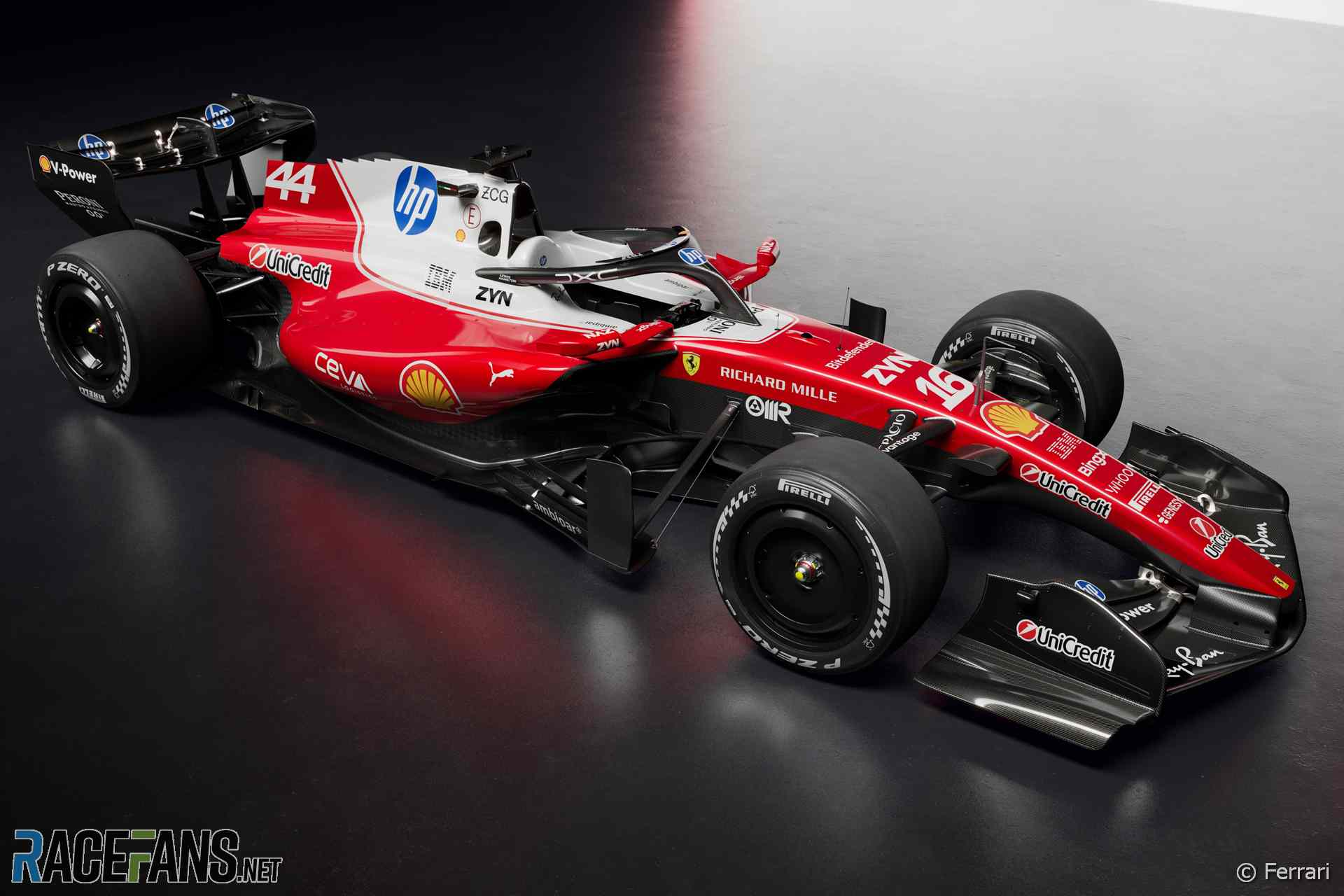
Ferrari has revealed the SF-26, its new car for the 2026 Formula 1 season
The team launched its car at its base in Fiorano, Italy today.
Advert |
Frederic Vasseur, who is heading into his fourth year as team principal, said “the SF-26 marks the beginning of a new era for both Formula 1 and Ferrari, with new regulations introduced in the same year for the chassis and the power unit, as well as new fuels and new tyre sizes.”
Ferrari endured a disappointing 2025 campaign in which it fell from second in the championship to fourth place and failed to win a grand prix. However it diverted its efforts to its new car development programme early, which Vasseur hopes will pay off.
“This car is the result of a tremendous team effort and represents the start of a completely new journey, built around a different set of rules that inevitably brings a number of unknowns,” he said. “The team is aligned and more united than ever as we look ahead to the season.
“From next week in Barcelona, we will begin the process of understanding and validating the car. In this initial phase, the priority will be to learn as much as possible and to start building solid foundations ahead of the opening race.”
Lewis Hamilton is going into his second year as a Ferrari driver. He said the new rules are “probably the biggest regulation change I have experienced in my career.”
Advert | Become a RaceFans supporter and
“When a new era begins everything revolves around development, growth as a team, and moving forward in the same direction. As a driver, being involved from the very start in the development of such a different car has been a particularly fascinating challenge, working closely with the engineers to help define a clear direction for the it.”
His team mate Charles Leclerc said the new rules “demand an even higher level of preparation, particularly for us drivers.”
“There are many new systems to understand and optimise, which is why we have been heavily involved from the early stages of the project’s development. During my time with Scuderia Ferrari HP we have already experienced major regulatory changes together, so we know how complex this challenge can be, but we are working with a lot of motivation to arrive on track as well prepared as possible.”
"No big problems or unexpected things" – Charles Leclerc says the new Ferrari SF-26's shakedown test at Fiorano went smoothly.#F1
— RaceFans (@racefans.net) 2026-01-23T16:51:15.242Z
Advert | Become a RaceFans supporter and
- Williams confirms it will miss first test of 2026 next week
- First pictures: Alpine presents its livery for the 2026 F1 season
- Watch Alpine’s 2026 F1 season launch event
- Every new F1 car of 2026 so far pictured: Official images, liveries and more
- “Weird” and “easy” overtaking moves likely under F1’s new rules, McLaren predict
Browse all Formula 1 articles
Got a potential story, tip or enquiry? Find out more about RaceFans and contact us here.
black (@black)
23rd January 2026, 10:42
People said they didn’t like the white stripe in last year’s Ferrari, and Ferrari was “say no more, we’ll add even more white to make the sponsor stand out”.
I like the glossy finish of the lighter red but in terms of design, nothing beats the 2023 & 2022 liveries for me.
Tony Mansell (@tonymansell)
23rd January 2026, 10:52
it looks better, more evoking the 76 Ferrari than last years slapped on white rectangle
roadrunner (@roadrunner)
23rd January 2026, 12:43
Unfortunately, it does also evoke the notorious F93A, one of the Tifosis’ all time nightmare.
Tifoso1989 (@tifoso1989)
23rd January 2026, 13:08
Also the SF16-H that didn’t win a single GP despite all the hype for that season to challenge Mercedes…
Edvaldo
23rd January 2026, 12:37
Looks like they enjoyed the Monza livery.
Didn’t need the white to make the sponsor stand out though.
black (@black)
23rd January 2026, 12:59
Yeah but Monza’s 2025 livery was much better executed for me, the whole engine box was white. The livery followed the lines of the bodywork.
Here the white part curves awkwardly upwards halfway in the shark fin (don’t get me started on that ‘pixelated’ like version of it), which makes it look weird from some angles.
This is a general trend I don’t like in modern liveries, they don’t follow the lines of the bodywork, they look too messy. They have some random spots painted and follow some weird zig-zags or curves that only look good from one side but not overall.
For example the McLarens of the last few years feature a diagonal orange cut in the rear end, which looks normal if you look it only from the side, but weirder (to me) if you look it from other angles… whereas in the Vodafone chrome McLarens, the sponsor blended smoother in the sidepod because the red followed the lines of the sidepod.
John
23rd January 2026, 14:37
It´s a Toyota?
Zxc
23rd January 2026, 10:55
Someone did a fantastic job with the livery. It’s clean and no blue elements are mixed with red, which was the worst thing.
We’ve got a classic white cockpit and classic black wings. And I like the shape of the nose cone. It’s a very nice Ferrari.
S Arkazam
23rd January 2026, 13:41
Even though most don’t like it, the colour combination red, blue, white represent the national flags of the majority of teams and drivers.
I might be wrong, but I believe it has been part of the podium ceremony ever since Singapore 2022.
Philip Roden
23rd January 2026, 10:58
You can normally rely on Ferrari to look special – but this loses too much of their identity. No need to mess with it, go back to 1995 and repeat
anon
23rd January 2026, 11:40
Philip Roden, as noted by others, given this is intended to evoke a comparison with their cars from the 1970s, this is a case of Ferrari harking back to their previous heritage.
Added to that, the livery of 1995 that you are harking back to is also notable for making it’s tobacco branding a prominent element of the design, which is not exactly that popular these days.
Philip Roden
23rd January 2026, 14:23
Still not a fan, maybe some like the comparison though. Obviously the sponsors names have changed, but getting back to a blood red Ferrari without all the mess would be a win
MurasamaRA300 (@murasamara300)
23rd January 2026, 11:08
The male (a.k.a the NART) of this species is blue and white, whereas the female is red and considerably larger.
During the courtship, the smaller male NART hops onto the large red female and inserts its sponsorship logo while on top. The resulting forces are strong enough to scrape some rubber off the female’s (w)heels. Sometimes this rubber comes from “inter” tyres and it is laid down hard on the “course”.
This complex courtship goes on for at least one year and the NART male stays on top throughout the entire time. The happy couple hopes their combined efforts will net them a string of world champions.
MurasamaRA300 (@murasamara300)
23rd January 2026, 11:12
PS. Jokes aside, I actually think it looks great. 8/10
Tony Mansell (@tonymansell)
23rd January 2026, 11:13
Livery aside i see we have an unwelcome return of the shark fin, turning vane. Aesthetically its a disaster and the serrated edge on the Ferrari is the worst iteration yet. JUST as we were making significant progress
PeteB
23rd January 2026, 11:15
Doesn’t look like a Ferrari to me… It just looks a bit cheap. None of the sponsors seem integrated with the overall design. If you look at the Mercedes, all the sponsors have their own fonts etc but they all fit together whereas this looks like a backmarker team who just slapped a bunch of stickers wherever the sponsors wanted them. It’s odd…
fawkes
23rd January 2026, 11:20
Lauda’s 70s and 2016’s Ferrari echoes here. Also resembles a lot the retro version of Monza 25. I like it. Is it the end of matte finishes?
Some points caught my attention:
– the skinny airbox, much like the early to mid 2010s; and the pronounced sharkfin
– this mounting point/supporting thing on the barge boards… an element for stability?
– the nose cone arched mounting points to the front wing
– a more angled front wing in general
– a wide/large sidepod overall
Andy (@andycz)
23rd January 2026, 11:24
2016 vibes… And it wasn’t their best… I hope it will be fast!
Rooie Piet (@axel3304)
23rd January 2026, 11:33
Selling their soul to their sponsor. It won’t be long before their nickname will be the HPrancing Horse.
Phil Norman (@phil-f1-21)
23rd January 2026, 11:40
I am not keen on it. I think the integration of the largest, main HP logo is better than in 2025. Definitely smarter. But do they really need five HP logos on the car?
Then there is too much black on the car for me. I would have much preferred the front and rear wings to be red. The black tones it all down. It strikes me as being a bit dull and uninspiring.
fawkes
23rd January 2026, 13:08
Definitely there is too much black indeed. By only using more red on the underbody (cockpit and sidepods) would do the trick.
Dan Rooke (@geekzilla9000)
23rd January 2026, 11:46
I know I’m going against the grain a bit here, but I like it! Sponsors are always going to be slapped on the car and it looks to me like some thoughtful design has gone into making sure they interfere the least they can with the overall scheme, the HP logo on the sharkfin actually looks quite good rather than an awful clash.
I daresay part of the sponsorship deal stipulates how many times, where abouts and how many square centimetres the sponsors get, getting them on the car in a way which looks intentional must be battle.
…But I still prefer the 2022/2023 cars livery designs – those were things of absolute beauty!
Esmiz (@esmiz)
23rd January 2026, 11:50
Not related to Ferrari or this launch in particular.
This year is confusing. I don’t know if I’m watching launches of color designs or complete cars. In theory, it was just the liveries; however, the cars are different from one another, and even so, I still don’t believe this is what we’re going to see in testing.
I don’t like a standardized launch like last year but this either; a middle ground would be fine.
Tony Mansell (@tonymansell)
23rd January 2026, 12:02
just roll with it, some of it is deliberate misdirection, some of it will stay on, some of it will come off. Unless you are doing a thesis on car design 2026 and have to hand it in before race 1, it is classic F1
Dan Rooke (@geekzilla9000)
23rd January 2026, 13:01
It is confusing, some teams have shown liveries only (so the design on a generic car) whereas others have shown their car – BUT, it’s not actually the car, it’s a computer render so it will maybe (almost definitely) have some details altered.
There are some clips of cars on track, so at least that’s ‘proper’ car footage.
But next week when testing officially starts, that’s when we’ll get to see the cars for real. There’ll no doubt be some changes before the first race, but the core design philosophy will be there to see.
anon
23rd January 2026, 13:25
@geekzilla9000 it’s been a bit of a mixture, although some of the more recent launches have featured studio shots that are closer to what has been seen on track during the initial shakedowns.
As for how developed the cars may be, a few teams have indicated that they’re planning to introduce upgrades during the tests, with the first test more oriented towards collecting data on how the new power units perform, testing the new active systems and generally establishing a baseline that they can then work from.
Additionally, Williams have confirmed that they are not going to be attending the Barcelona test – we might get some shakedown footage in the meantime, but we’re probably not seeing their car until the first test in Bahrain.
MichaelN
23rd January 2026, 11:56
Eh… I can sort of see the idea, but I’m looking forward to seeing it with different rims because these black ones aren’t doing it for me.
Sonny Crockett (@sonnycrockett)
23rd January 2026, 12:10
I really don’t like it but maybe it’ll grow on me.
Doesn’t shout FERRARI to me. Looks more like a B Team car.
Phil Norman (@phil-f1-21)
23rd January 2026, 14:27
I am inclined to agree.
SteveP
23rd January 2026, 16:38
Doesn’t shout FERRARI to me. Looks more like a B Team car.
Just wait until it shows its performance level vs. other teams.
Then you will probably be saying “Yes, it’s Ferrari and B team spec. Again.” Sigh.
notZack
23rd January 2026, 12:34
Honouring their new title sponsor’s line of printers, Ferrari ran out of colour before it could finish covering the whole car.
Bullfrog (@bullfrog)
23rd January 2026, 12:35
Black wings (I approve) and lower bodywork – didn’t they do that last time the rules changed? All the better for hiding the details.
Nose is a pleasing shape, more like 2022 than last year. Some serious heavy metal on those turning vanes and barge boards. They’ll be the first thing rivals aim at to disable a car! They’re the new floors.
As for the white, either like Trump we’re all getting used to it, or it’s been quite nicely done here, not overdone like Monza last year.
Tifoso1989 (@tifoso1989)
23rd January 2026, 13:16
I’m not sure why, but my first impression reminds me of the SF16-H. It wasn’t a bad livery in itself, yet my mind associates it with disappointment because it lacked competitiveness. Hopefully, this one will tell a different story.
Maciek (@maciek)
23rd January 2026, 13:44
I like it. It’s easy to take digs at sponsorships dictating liveries, but of course some of f1’s most classic liveries were designed around sponsor colors and imagery. I’m not saying this couldn’t be improved, but it’s clean and sleek.
FlyingLap (@flyinglapp)
23rd January 2026, 15:23
If it wins races it could be lime green. As long as it’s fast who cares about the livery?
grat
23rd January 2026, 16:02
Some interesting design choices. I assume this is the “Spec A” car, which should be a bit more conservative than the “Spec B” that shows up at Bahrain. At least, I hope so– the SF-26 looks unfinished compared with the W17.
Your email address will not be published.
All comments are moderated. See the Comment Policy and FAQ for more.
© 2025 Collantine Media Ltd | About RaceFans | Change consent

